Screenshots of the Mi Casa website.

CASE STUDY

Narrative storytelling for tenant education

This project was a concept for an educational mobile website as part of my Master’s Capstone.

Challenge

After mass pandemic layoffs, low-income immigrants are more vulnerable to eviction than ever before. How might we guide them in taking the necessary actions to protect their homes?

Solution

My House, My Rights is a mobile-first, Spanish language website that situates tenants' rights and resources through a series of illustrated, contextually relevant scenarios.

Our Approach

  • 01 Context/user research and synthesis
  • 02 Ideation and requirements gathering
  • 03 Designing and prototyping
  • 04 Testing and evaluating

01 Context/user research and synthesis

We started out by formulating a research plan. This helped to structure our discovery process by outlining research questions, methodologies, and data needs.

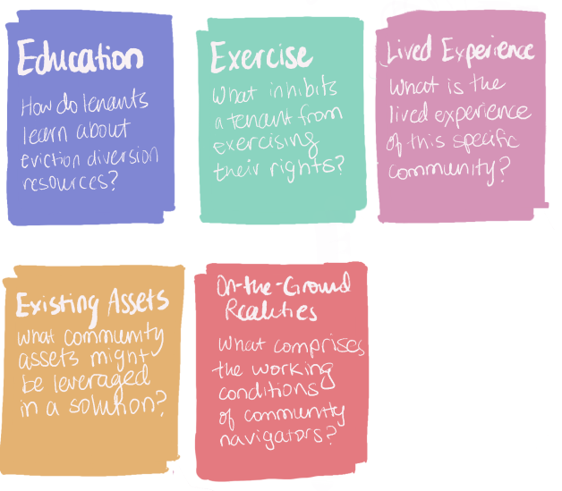
We conducted a variety of various research methods to build foundational knowledge as well as to learn about existing pain points.

01
Research Method
Observation

Rationale: Gather data on how the organization operates. This also allowed us to participate in volunteer events, build trusting relationships with the staff, and empathize with the situation the community faces.

02
Research Method
Interview

Rationale: Gain a high level understanding of the challenges from staff and experts. Also spoke with a community resident to contextualize our research to a real scenario.

03
Research Method
Focus Group

Rationale: Besides its efficiency, a focus group encouraged productive dialogue between community navigators when reviewing the various design probes that we presented.

04
Research Method
Contextual Inquiry

Rationale: Helped us to understand the communication strategies and interaction between the staff and a community resident in a typical context.

Although it would have been ideal to speak to more than one tenant, we understood that it's not always appropriate to expect social services recipients to be research subjects of early research or prototype. We overcome this challenge by leveraging community navigators as proxy users.

As we gathered research, we synthesized our research by clustering notes into themes, which we have summarized in the below findings.

Key Findings

Finding reliable resources is challenging.

It’s hard to know where to look. Residents sometimes share information, but the validity remains dubious or contradictory. In addition, it’s important that information is relevant to oneself — for example, knowing whether help can be obtained locally or if one meets eligibility reqs.

“There are a lot of families that do not have access to this kind of information. The families also look for this kind of help but they cannot find it.” - Community Navigator

Avoid overdelivering to maintain community trust.

Sometimes resources fall through. Although entirely out of their control, staff risk losing the trust of the community when this happens. Staff agree that being as honest as possible is a key part of managing expectations and maintaining trust with the community.

"When we send a resident to get rent assistance, sometimes they are not getting what they expected. People are very stressed and worried and when things don’t happen as fast as they do, sometimes they get frustrated with us."  - WATL staff member

Tenants do not feel empowered to seek aid.

As a result of their lived experience, we learned the tenant tends to rely on others or is less confident in their own ability to accomplish a task. This can also lead community members to prematurely self-disqualify or dissuade them from taking initiative (A community member might say "Why would I go to them? They don't speak Spanish").

"I am not good with technology so I ask my daughter, but she's better at English than Spanish so some things she can't translate.” - Tenant

As an imperative, we settled on the following:

“A good solution should help build the confidence of tenants in themselves, in their current environment, and in their government.”

In responding to this imperative, we aim to shift power to the community in enabling their own capacities to understand and leverage their tenant rights. We would also ensure to create positive relationships between WATL and the residents such that trust and accountability could be upheld.

02 Ideation and requirements gathering

Though we felt we could research this topic forever, there came a time where we had to shift gears towards problem solving!

IDEATE

With research insights in mind, each team member sketched a slew of ideas (~25), valuing quantity, before refining down.

Deliberate

Each member presents the most promising ideas round robin style. Team offers clarifying questions and possible risks or roadblocks.

Vote

We vote using the four categories method, casting one vote each for the most rational, delightful, darling, and longshot idea.

At the end of this process, we converged on two ideas:

  • A resource and knowledge repository (Most Rational)
  • Capacity-building through storytelling (Most delightful, Longshot)

At this point, our team of five split into two sub-teams, allowing us to design two unique software solutions for Welcoming Atlanta. My teammate Ryan and I formed the team that would tackle the Storytelling project.


Exploring a storytelling concept

To communicate our concept, I created a storyboard. A woman has received an eviction notice. Her use of the system prompts her to start a dialogue with a community navigator ideas about what she should do next.


Stories are memorable and effective communication strategies. Our hypothesis was that using stories and visual guides would aid in experiential learning, exposing the individual to a challenging scenario and how to navigate it. The idea is simplify information for easy absorption and to positively depict help-seeking in order to reduce cultural and social stigma.

The idea is simplify information for easy absorption and to positively depict help-seeking in order to reduce cultural and social stigma.

Before moving on, let’s recollect ourselves and the problem scope, shall we?

We often think providing helpful information to others — maybe about a pro-bono law firm or a community org that is offering housing assistance — is enough to inspire action, like so:

Whereas in reality, there are often many barriers to overcome:

We used context scenarios (such as imagining the user's state of mind while undergoing eviction) to define design requirements for a new system and address the aforementioned barriers.

Defining Design Requirements

Fragmented & incomplete information

1

System must include clear steps on how to manage crisis.

2

System should allow users to discover resources in context, embedded in the narrative.

Inaccessible information

3

System should accommodate low literacy users and those not familiar with technology.

Anxiety

4

System should use stories that are similar and authentic to users.

5

System should acknowledge multiple courses of action/varying contexts.

03 Design and prototyping

Our design process can be broken into 4 steps:

  • Sketching
  • Wireframing
  • Mockups
  • Prototyping

Sketching

From quick doodle to legitimate wireframes. Sketches helped guide internal discussions and design exploration. As visual representations, they also helped establish shared understanding with the client about the idea.

Wireframing

I graduated the sketches into wireframes. These helped us to establish user flows, interaction styles, and information architecture. I also used this step to seek feedback from the larger team and my advisor.

Example of an early user flow. (1) The user identifies whether they are in an emergent situation or at risk; (2) User then swipes through a carousel to select a scenario; (3) User views the overview page before starting the story.

Our team used Miro to showcase design alternatives and compile feedback internally (through stickies).

Mockups

In conjunction with wireframing, I created a few static mockups of what a page might look like. This not only helped the client to really grasp the final product, but also helped us to establish the look and feel to dictate the UI for the build.

Our team used Miro to showcase design alternatives and compile feedback internally (through stickies).

We went through many iterations of the landing page, playing with user interface elements, copy, layout, and color palettes before settling on the final version.

Prototypes

Finally, using our wireframes, I built an interactive prototype via Figma in order to conduct user testing and evaluation. We decided the prototype should be of high-fidelity in order to elicit meaningful feedback from our test group.

This was certainly a tall order! All screens in one user flow had to be built out in their entirety. This meant drafting one complete story including narrative, resources tooltips, and illustrations.

04 Testing and evaluation

No UX process is complete without evaluating the design with actual people! I developed a formal protocol to collect data on the following key metrics:

  • Usability of the Product (navigation and interface)
  • User’s attitude on the perceived effectiveness of the Product

The study was conducted via web conference. In the ideal scenario, the participant was able to share their screen as they used the prototype; if not, we shared our screen and asked them to direct us.

For participants who were not fluent in English, we enlisted the help of our teammate Santiago to conduct the session.

After each testing session, we revised the prototype before the next session (for example, if a participant failed to understand how to interact with the interface or if the narrative was written in unhelpful or inappropriate manner).

Here’s us with a Welcoming Atlanta Staff member as she shares her screen using the prototype. Feedback from staff members was helpful to conduct first to capture glaring issues.

Evaluation Results

✅ What worked

❌ What could be improved

  • Clear story
  • Captivating illustrations
  • Navigating in story mode (scroll, chapter jumping)
  • Tooltips
  • Belief that users might consider recommended steps
  • Use of difficult words or vocabulary
  • Triggering instances
  • Complicated landing page
  • Unclear speakers in dialogue
  • Unused or distracting features (such as story mode chapter menu and steps modal preview on story select)

Results from the evaluation were positive and helped to validate the concept. This was best encapsulated by a community navigator in one of the latter sessions, who shared the following:

“The story is really happening — it almost feels like it is happening to somebody, so this is really what is happening in real life. While reading, it feels like I was going through it myself...we know we have rights and there are organizations that can help us. But ourselves, we have to speak and communicate to learn more about our rights.” (Translated loosely from Spanish)

— Community Navigator

Final Design

Link to website

Feature 1

Linear navigation

Supports our design requirement #3 to accommodate individuals less familiar with technology. This also follows the guideline for linear navigation architecture being the ideal mobile interface design for low-literacy populations.

We eliminated any branches or modal pop-ups to remove any confusion about the given action on a page (demonstrated here by a clear yellow button in a visible location on each page).

Feature 2

Minimize interaction complexity

Supports our design requirement #3 to accommodate individuals less familiar with technology. This also follows the guideline for linear navigation architecture being the ideal mobile interface design for low-literacy populations.

Minimizing interaction complexity meant eliminating interactions that were not familiar to our users. During testing, we noticed that participants habitually swiped up to scroll even if this not the intended interaction. In story mode, the text scrolls no matter where on the screen is swiped, leveraging this natural behavior and decreasing the accuracy required.

Feature 3

Interactive tooltips

Supports design requirement #2 to facilitate users in easily finding resources in context.
Supports design requirement #3  to, again, accommodate low literacy users who learn best through example and are most likely to benefit from definitions of words like “eviction moratorium” they might not be familiar with.

One design challenge was how to incorporate details of a resource like contact information without simply listing it. Story tooltips were a lightweight method to accomplish this. Definitions and resources are denoted by different colors and include an animated tap icon to help users notice them (after we observed many participants skip over them).

Feature 4

Clear, actionable steps

Supports design requirement #1 in that it accommodates someone who may be in crisis and needs immediate action items now.

Our website needed to provide clear and actionable steps to the reader. Before getting into the story, the user is presented with an overview page that offers a clear roadmap of steps that are taken in the story. This could be used by someone who does not have time to go through the entire narrative or serve as a reference/refresher to someone who has already completed the story.

Feature 5

UX Writing / Content Strategy

Supports design requirement #4. We used stories that are similar and authentic to users.
Supports design requirement #5 that the system should acknowledge multiple courses of action and varying contexts so as to still be applicable to all readers.

The language in the narrative had to be concise and accessible to our target population, while being fleshed out enough to speak to their lived experience. We wrote scenarios using anecdotes we collected from staff and community members during our research.

However, being too specific might alienate readers whose situation did not exactly match that of the narrative’s. One strategy we took was to anticipate where the reader’s situation might deviate from the story and offer alternate action steps the reader might take instead.

Reflection

Designing for communities was always going to be different from your typical project. Things change rapidly — after one month of research and groundwork, we ended up changing the entire scope of our project after a single meeting with the client. Instead of solely focusing on design research in the first semester, our time was split building an emergency website.

There were also many times where we planned a scripted evaluation or interview guide, and it would be derailed in response to participants’ reactions, confusion, and limitations with technology. Later, we started to run on the mantra that ‘Things should be good enough’ — it was more important to capture as many points of feedback as possible than worry as much about running the perfect study or how a questions was phrased, for instance.

I really enjoyed working on this project, and cherish the friendships we made with the staff and navigators. This works requires patience, but I believe wholly that good design always does.

Picture I snapped of Welcoming Atlanta staff during a volunteering event!

Special Thanks

Special thanks to all the staff and navigators at Welcoming Atlanta for supporting this process and giving us their time. Also thanks to lawyers at AVLF for consulting our team and for their interest in expanding this work.

I also cannot forget our advisors Dr. Carl DiSalvo and Dr. Chris Le Dantec for regularly meeting with our team, guiding us, and generally serving as moral support! We couldn’t have done it without you!