Case study
Designing two sides of an Early Childhood Education grant system
This project was a client engagement I worked on at Exygy prior to the restructuring of our consulting business line.
Challenge
Approved funding towards early childhood education sat tied up in legal battles with taxpayer groups for four years. When it was finally upheld by courts, the pressure flipped overnight to release funds for struggling educators barely holding on after the pandemic. How might we help First 5 stand up a grant system in months, not years?
Solution
We built a system using a low-code tech stack with two front doors — one for educator applicants, one for reviewers — designed around a simple idea: reducing friction.
I conducted a kickoff workshop and other discovery to gain insight into the needs of the organization, the providers, and First 5 staff.
Existing product gaps
Lack of connectivity
Application data couldn't flow to finance for payment or from the third-party data sets and systems the grant depended on.
Lack of automation
Pre-approved lists, GIS data, and existing provider records couldn't be used to speed up vetting.
Choosing user research methods
- Desk research. Researched existing literature about the realities faced by California early childhood educators to compensate for shortened timeline.
- Stakeholder interview. Interviewed client stakeholders - including finance, data team, and program managers - to capture varying defintions of success.
- Proxy user workshop. Conducted mini-workshop with front-facing technical assistant staff to get a clearer picture of who the early childhood educators are and what barriers they face in past applications.
Key findings (Providers)
Family educators face disproportionate administrative burden.
Desk research showed that home-based providers (often a single person juggling less time and fewer resources) face more barriers than center-based providers, who typically have a director and dedicated admin staff.
"I don't have capacity."
Eligibility is almost impossible to self-determine.
Eligibility rules like "operating in a census tract where at least 5% of the population is below poverty" are hard to explain and even harder to self-assess. The result: a lot of blind applying, and a lot of wasted effort.
"So — am I eligible?"
Family educators face many technilogical and usability barriers.
Between data entry errors, upload issues, and simply not having time to sit at a computer, the application itself was a barrier before eligibility even entered the picture.
"Uploading the documents is hard for me."
Next, I worked with the delivery team to collate and and assess all possible product requirements we heard during discovery.
Working alongside engineering, we took every request through three steps: repeat back what we heard, translate it into technical terms, then surface the trade-offs with program managers. In this way, we worked to stay aligned with the intended outcome, while keeping feasibility and risks in check.
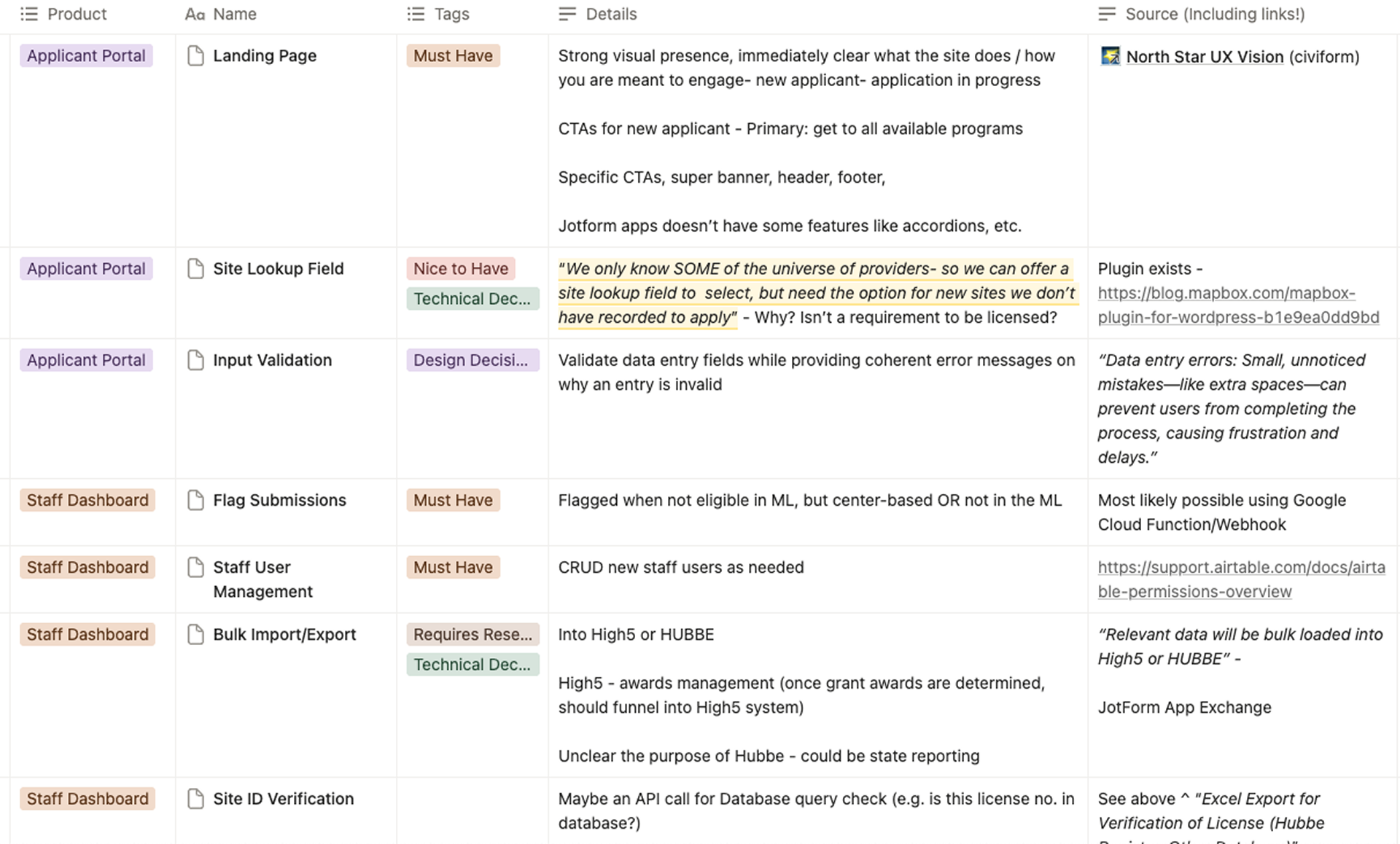
A running list of requirements, outlining which side of the product it would serve (applicant vs staff), its relative level of necessity (must-have vs nice-to-have), and its source (whether that be from stakeholder interviews, to design best practice).
Choosing a tech stack

Our low-code tech stack.
Given the timeline, we deliberately chose a low-code stack: WordPress to explain the grant, Jotform to collect applications, Airtable for staff to review them, and DocuSign to close out contracts. Not the flashiest stack — but the fastest path to something real in providers' hands and possible for First 5 to sustain.
Designing for the most constrained applicant
How might we design an application process for under-resourced educators so that can navigate it with confidence?
Key features

Action-oriented funnel
I sequenced the applicant journey into five steps, built around the goals of reducing barriers to entry and never leaving the applicant guessing. Each step would be action-oriented, with clear transition into the next. Per our design guidelines, I pushed back on frontloading the intial application with document uploads (now step 4). Although this ultimately would require more back and forth with the applicant, it would help to reduce barriers so applicants could at least get their foot in the door.

Simple questionnaire to support eligibility self-determination
The actual eligibility rules were genuinely complex. Home-based vs. center-based, single-site vs. multi-site, census tract, subsidy thresholds. I mapped the entire decision tree, validated it against real cases, and optimized it to ask as few questions as possible. One requirement — "operating in a priority census tract" — was nearly impossible for applicants to self-check. We built a custom GIS integration so people could just search their address and see whether they fell inside the eligible zone, with the result also written out in plain text for screen reader accessibility.

A guided applying experience
I restructured First 5's original application draft into a 7-step form with a consistent content pattern for every page — clear section titles, helper text, and error states — so the experience felt like a person helping.

Multi-site license lookup
For multi-site agencies, I designed a license lookup flow so applicants could search their existing child care license number and pull in site details automatically, verifying data without having to re-enter every field from scratch. This was especially useful for applicants who were applying on behalf of a multi-site agency.
Across 9 beta testers, we learned that those who rated their experience lowest both struggled to understand email follow-ups.
Rather than testing a standard prototype, we collaborated with First 5 Alameda County on a live "beta test" that served as the actual grant application. This provided participants with a strong incentive to engage. It also avoided confusing or disappointing users with a fake system, protecting our strategy while ensuring clarity.
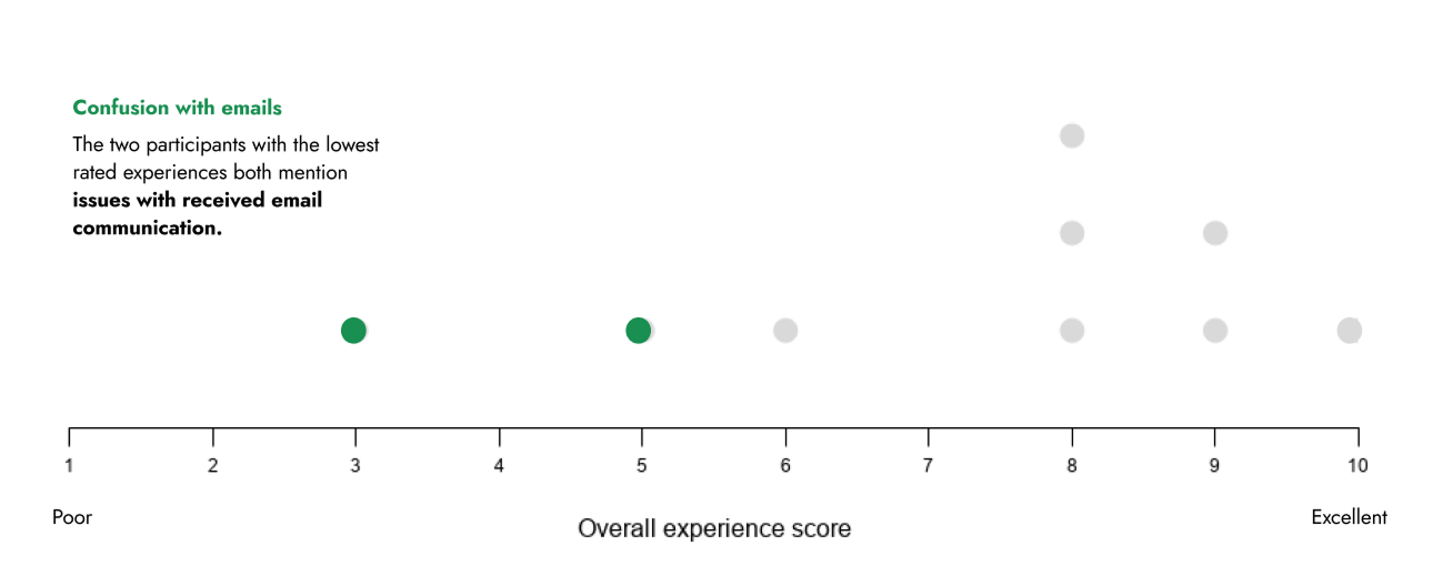
Beta testing results. Both particpants who rated their experience lowest cited failure to understand emails.
User feedback
“I finished the application in the virtual (session). And then I was getting emails saying, your next step is this. I didn't know where to go for my next step.”
“The order of how to do things was confusing. Do I click for the next step? Email? What do I do? I got lost during the email follow ups to know what the next step was.”
To address the confusion, I redesigned the "status" in the email content from passive status to action-oriented steps, giving every email a clear purpose and next step.

Designing for the two different types of reviewers
How might we streamline internal workflows for application review staff so that they can process applications faster and more accurately?
Key features

Parallel review
I worked to simplify the internal review into four clear stages: verify eligibility, calculate award, confirm follow-up documents, sign contract. A live demo with the client surfaced a gap — finance staff, who confirm insurance after the contract is signed, weren't accounted for anywhere in the flow. We added a parallel track just for them.

Automated eligibility and actions required
The final interface gave each review step its own focused screen. Thanks to our engineers improving connectivity with other datasets, our system now auto-populated eligibility where possible, and auto-surfaced the specific action required based on provided information. As the ultimate decision maker, the reviewer utilized a single button to advance or reject the application.

Comments panel
A universal comments panel helped reviewers flag questions, preserve discussion across parallel review processes, and support escalation — all without leaving the record.

Duplicate detection
Usability testing surfaced a specific, fixable problem: a "Duplicate Detected" label appearing only on the second applications was being misread by reviewers as a denial signal; as a result, the application with the label was getting rejected. This presented an obvious issue, considering the secondary application has the chance of being the accurate or corrected version. We corrected this by applying the label to all applications, prompting the reviewer to investigate both versions.
Six months is a short runway, and we knew from the start we may not be around to support the system after launch. Throughout the entire process, we were embedded with First 5's admin and tech teams, ran live demos and trainings, and wrote a user manual and technical documentation covering how to manage content and translations across every platform we'd used.
On June 11, 2025, First 5 launched publicly. For seven months, they owned it — and delivered $53M in critical relief.
On June 11, 2025, First 5 launched the grant publicly — and ran it themselves for seven months.$53M in critical relief delivered 925+ child care programs and centers served 42% decrease in application processing time within the first month 20+ self-directed system updates made by First 5 staff post-launch, with no outside help
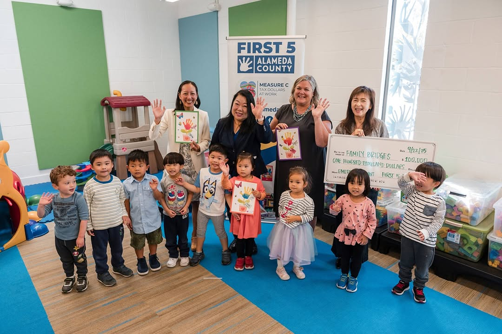
Early childhoods educators receive grant awards after applying through the grant system.
Results
$53M
in emergency relief delivered to child care programs and child care centers
1,046
child care programs served, indicating system’s widespread usability and service success.
42%
decrease in application processing time — from submission to approval — after first month in use, indicating system’s high learnability among First 5 staff.
20+
self-directed post-handoff system adjustments—including custom fields, automated workflows, and reporting dashboards—to adapt to evolving needs, driving high adoption and system sustainability among First 5 admins.
Reflections
Though the solution wasn’t flashy nor required copious hours in Figma, this project did pose a challenge in its orchestration.
What worked
Staying in continuous collaboration with the client. Because the grant itself was still evolving as we designed it, tight feedback loops were the only way to keep pace with changing requirements, to co-design, and to give First 5 real ownership over the system by the time we handed it off.
What I'd change
Clearer role boundaries with product and engineering, set earlier. With more defined lanes from day one, I'd have had more room to go deeper on the experience and interface design itself, rather than spending time renegotiating scope along the way.